

Responsive Website Design Company in Bangalore
We Turn Your Dream Figma Designs into Live, Functional Websites
Transform your vision into reality with our expert Responsive Website Design services. We meticulously convert your dream designs into live, fully functional websites that capture every detail and deliver an exceptional user experience.
Enhance Your Digital Presence with Responsive Web Design
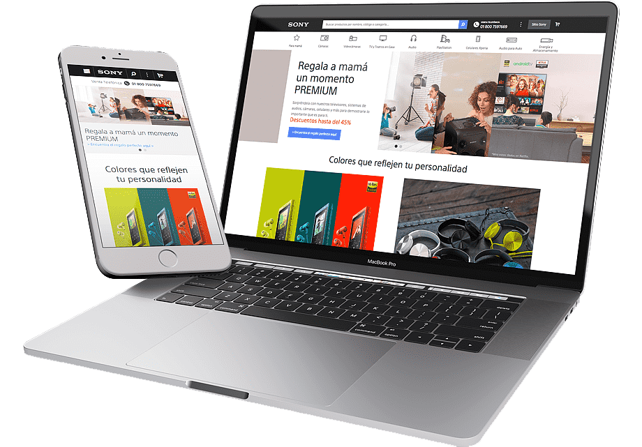
A website must function seamlessly on all devices to be important in today's online presence. Our Responsive web development makes your website look great and functions well on smartphones, tablets, and desktops. This is essential because mobile devices account usage for more than half of all web traffic worldwide. A responsive development can increase mobile user engagement rates by up to 50%, making it an important determinant for visitor retention.
Your website should be designed to attract attention not to maximize efficiency. According to research, 57% of users would not recommend a company with a poorly designed mobile site, and 88% are less likely to return to a site following a negative mobile experience. Our responsive development ensures that both mobile and desktop visitors can navigate and enjoy the design of your website.
Responsive development also enhances your site's performance and search engines. Google favors only mobile-friendly websites, which helps your responsive site rank higher in search results. Our advanced responsive development services adapt to various devices, providing an excellent experience for every visitor and leaving a positive impression.
How We Makes Your Website is Fully Responsive
Some important techniques and testing methods are required to make a website run smoothly on all devices. First, we ensure, layouts use flexible grids and media queries to adapt the design to the size and orientation of the screen. This method ensures that the content looks good on any device, including smartphones, tablets, and desktop computers.
In addition, we use responsive images and fluid typography to ensure that visual quality and readability remain consistent across all devices. Testing is essential for confirming responsiveness; thus, we conduct thorough checks using various tools and devices to simulate various environments, including browsers, mobile emulators, and real devices, to ensure that everything works and looks the same.